TD MySpend App
The TD MySpend app empowers users to take control of their savings and spending by tracking daily and monthly cash flow, categorizing expenses, setting savings goals, and providing real-time insights and transaction alerts.
Role
I worked as a UX Designer and UX Researcher cross-functionally on the Product Team.
Duration
One Month
Overview
Working alongside two designers, I collaborated to enhance the TD MySpend app's user experience, specifically focusing on how users view their spending. Through iterative design sessions and user feedback, we streamlined the interface to make spending insights more intuitive and accessible. Our teamwork resulted in a more user-friendly experience, empowering users to better understand and manage their finances.
Team
Two Product Designers
Tools
Figma, Sketch, Balsamiq, InVision, Pen & Paper
Scope
UX/UI Design, UX Writing, & Research
Problem
Users of the TD MySpend app face challenges in accessing and navigating their spending history, which impede their capacity to make well-informed financial decisions and plan effectively.
Analytics for thought
What do we know about the current state of the app? How many users use it? What's the demographic?
Millenials' Reliance on Mobile Banking
Much of the feedback revolved around wanting new features or other bug-related issues.
TD MySpend App Rating
The current rating of the TD MySpend app (iOS) lies at 2.6.
Millenial Usage of Banking Apps
More than one-third (36 %) of Millennials are mainly using banking apps
Target Users
Understanding that Millennials are more likely to be using the TD MySpend app, we created a persona. We merged our findings to represent what we felt best personified the "sticky," or returning user. Including ‘Catherine’s’ pain points and struggles ensured that we would keep our design entirely human-centered.

Getting the ball rolling

Get visual aid to understand spending habits and history

Get a clearer understanding of where money was spent

Improve navigation so all kinds of users can feel comfortable using the app
Task prioritization
Because the TD MySpend app has various features, we chose to work on redesigning the features that would:
Meet customer expectations
Generate satisfaction
We mapped out the various tasks a user may journey through, and prioritized from there.

TD MySpend Current Information Architecture
By studying how the menus and features are organized, we found potential areas where users may get confused.
For example, identifying how features like "Spending Insights" and "Transaction History" are grouped helped us see if users can easily move around the app to find what they need.

Journey mapping
Creating a journey map gave us the opportunity to gain a more robust understanding of our target user and how they’d be interacting with the app. We understood pivotal moments of design intervention and used them as the groundwork for building our redesign.
Identifying user pain points, tasks, and solutions
As a team, we conducted a thorough analysis of the challenges, motivations, and tasks of TD users. This process enabled us to gain valuable insights into the priorities of our user base and informed our decision-making on which features should be prioritized.
By closely examining the needs and goals of TD users, we streamlined our development efforts to focus on delivering the most impactful enhancements that align with their requirements and expectations.

Task flow
Using Balsamiq to break down the existing pages of TD My Spend App. Collaborating with Hossein and Shaina, we came up with an easier way to use the navigational flow.

Iteration 1
Simplified Insights & Analytics

BEFORE
The donut graph was changed to a bar graph for clearer spending insights, making data interpretation faster and more intuitive for efficient financial tracking.
Using all the groundwork we had established, we began redesigning the screens. We kept in mind that our user is a busy millennial, pressed for time, and perhaps not the most financially literate.
We prioritized changing the look of the transaction history to make the cards clean and much easier to reference.

AFTER
Showing previous and next month labels helps users make quick, informed choices, reducing cognitive load and enhancing experience. Changing the donut graph to a bar graph presented spending more clearly. We also redesigned categories and menu for easier navigation.
Iteration 2
Transaction History

BEFORE
Users find it time-consuming to navigate their spending history, struggling with categories and dates. They also noted the absence of a feature to visualize monthly spending easily.
One change: Removed category section; added option to sort transactions by earliest/latest in selected month for better understanding. Added navigation menu at bottom for quicker access to filters, user profiles, main menu, streamlining navigation.

AFTER
We added features to enhance user experience, including a time stamp for actions, a bottom menu for quick access to main features, and a sorting option for organizing content by date. These updates improved the platform's usability and efficiency.
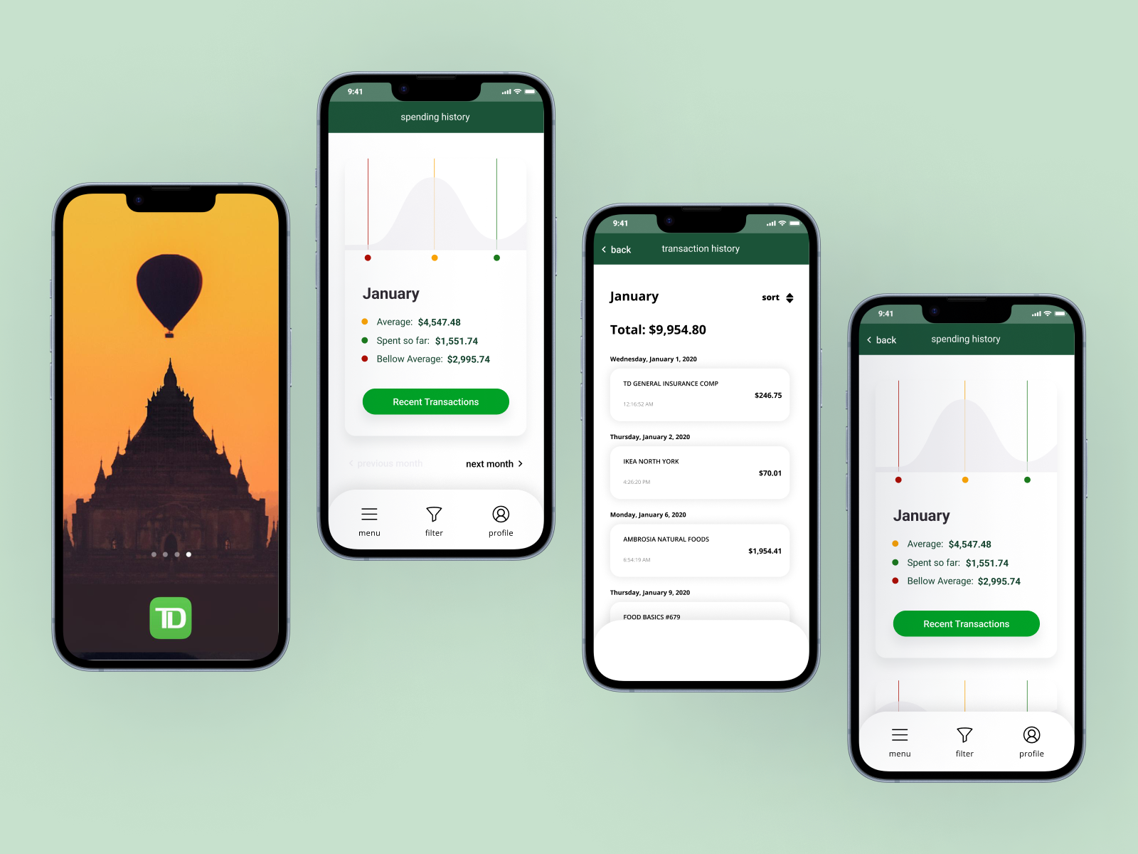
Final screens
Using all the groundwork we had established, we began redesigning the screens. We kept in mind that our user is a busy millennial, pressed for time, and perhaps not the most financially literate.
We prioritized changing the look of the transaction history to make the cards clean and much easier to reference. Changing the donut graph to a bar graph reflected the user’s spending in a more accurate, intelligible way. We also redesigned the categories and menu to allow easier navigation for the users.

Measuring Success & Effectiveness
Here is how we would measure KPI's in this project if it were shipped:
Time to First Interaction: The average time it takes for users to interact with the insights or history features after launching the app.
Navigation Path Efficiency: The number of clicks or steps users take to access their desired insights or transaction data.
Repeat Usage Rate: The number of users who return to use these features multiple times, indicating perceived value.