My MTA – Metropolitan Transportation Authority
The MyMTA app for iOS provides schedules, maps, and real-time alerts for New York's transit systems, using a modified version of the mobile website for consistent visuals and interactions.
Role
I was responsible for researching, testing, and ideating different ideas to improve the MyMTA mobile app.
Duration
6 Weeks
Overview
MyMTA is a mobile app designed to improve the transit experience for NYC commuters. Unlike other apps, it integrates schedules, maps, and real-time updates for Subways, Buses, LIRR, and Metro North trains in one place. MYmta offers a reliable, user-friendly tool with consistent visuals and interactions across platforms, enhancing the convenience of navigating the city's transit system.
Team
Taylor Peckham, Najot Ghotra
Tools
Figma
Scope
Heuristic Evaluation, UX/UI Design
competitor analysis
The myMYTA app faces several distinct competitors. I reviewed various types of apps, including those dedicated exclusively to public transit and others that incorporate additional transportation options like biking and walking.
Offers directions for public transit, walking, cycling, and scooters.
Known for its intuitive design and easy-to-use navigation.
Provides live updates on transit conditions, delays, and route changes.
Personalized trip planning based on user preferences and frequently traveled routes

Provides directions for various transportation modes.
Integration with real-time traffic data and incident reports.
Advertisements and sponsored content can sometimes be shown alongside search results.
Widely used and integrated into various third-party applications.
Offline maps and navigation available for areas with limited connectivity

Offers accurate, real-time data for buses, subways, and trains.
Includes crowd-sourced information for more reliability.
User-friendly interface with easy navigation and clear visual design.
Trip planning and service alerts.
Integration with ride-hailing services like Uber and Lyft
We based our re-design concepts on the results of our previous evaluation using Nielsen & Norman’s “Heuristic Usability Standards”. These were the violations we found:
NN/G HEURISTICS
Visibility of System Status
Match between System & Real World
Consistency and Standards
Recognition Rather Than Recall
Aesthetic & Minimalist Design
Help users recognize, diagnose, and recover from errors
Help and documentation

Identifying Key Pain Points in NYC's
Transit Experience
By pinpointing these statistics, we gained valuable insights into the areas needing improvement, allowing us to focus our design efforts on enhancing user satisfaction and transit reliability.
5,437,587
Weekday
riders (avg.)
59,136
Trains delayed during first 10 months of 2018
62%
of subway riders said that they were unsatisfied with the service
EXPLORING THE SPACE
We conducted an in-depth analysis of user feedback regarding the app to gain valuable insights into its performance and user experience. By closely examining user comments, suggestions, and complaints, we were able to identify trends and areas for improvement. This user-driven approach allows us to continuously enhance the app and ensure it meets the evolving needs and expectations of our users.
COMMUTER SPECIFIC | OVERALL RATING 2.9/5
“It’s a so-so App”
“The signs in the station show arrival times, but not the app.”
“DO NOT WASTE YOUR TIME WITH THIS APP”
Problem
The mobile application is currently experiencing a heavy influx of users, and unfortunately, it lacks the necessary accessibility features to cater to a diverse range of users with varying needs.
original task flow
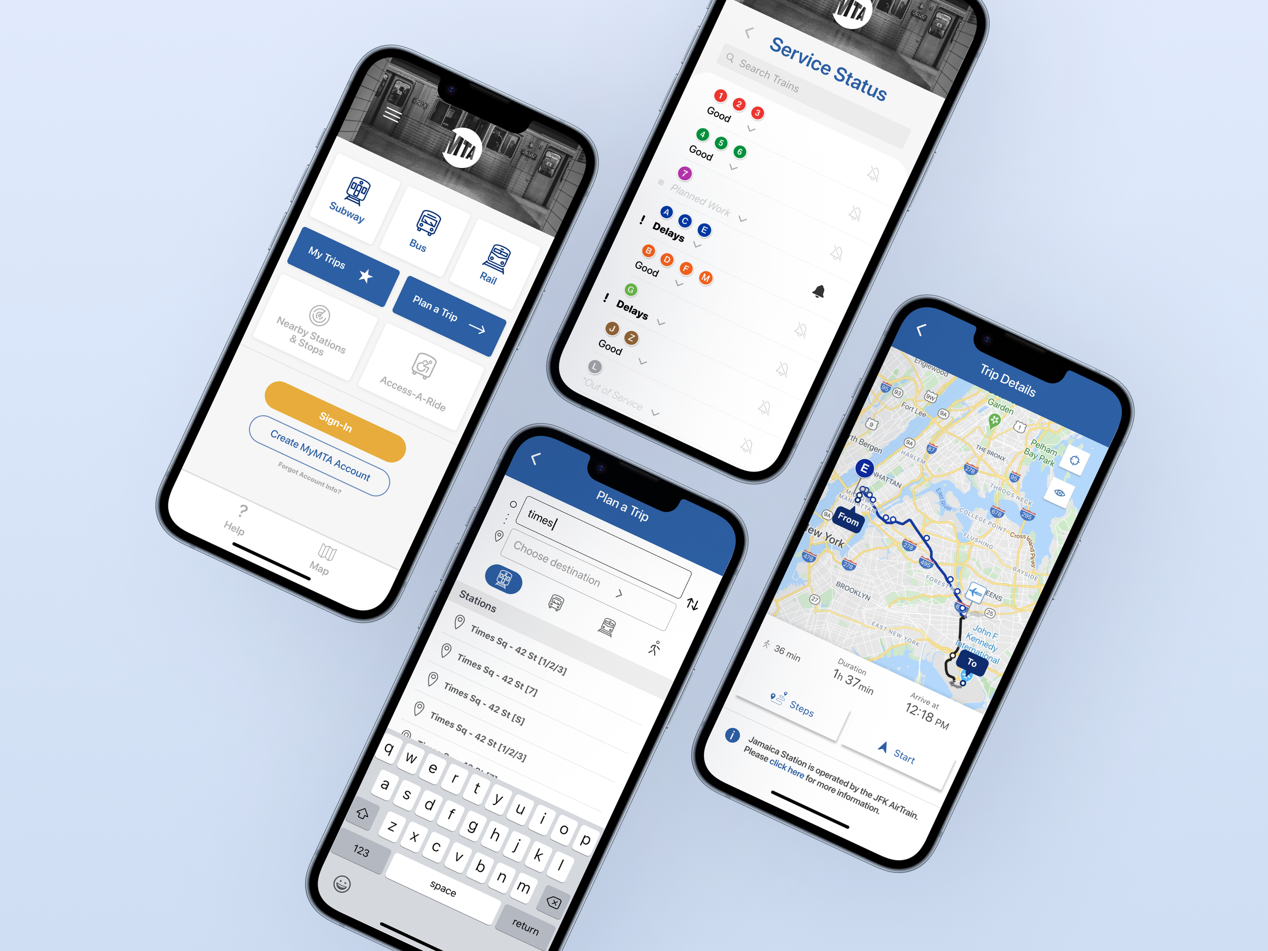
We tested the current state of the “My MTA” user experience through a common commuter task flow: traveling from Times Square to JFK airport via MTA public transportation.
This flow consists of the user opening the app, arriving at the Home Screen, inputing and selecting their destination in “Trip Results”, then selecting and viewing their “Trip Details”. This flow is outlined here, through these 7 screens.
Home Screen
Heuristic #8
Aesthetic & Minimalist Design
4
Catastrophic | Imperative to fix
The initial Home Screens were too cluttered. Important items were low, unimportant ones were high, and all subway lines were displayed together, which could confuse even seasoned NYC commuter.
Changes
Moved modes of transportation to the top
Provided a sign in option for the user’s MyMTA profile, helping them customize the information they see, further increasing the focus on ”Minimalist Design”.
BEFORE
AFTER
SERVICE STATUS Screen
Heuristic #8
Aesthetic & Minimalist Design
4
Catastrophic | Imperative to fix
Changes
In the newly added “Service Status” screen (where the subway lines are now located), the lines are now organized by color, to help match their organization at subway stations around the city.
BEFORE
AFTER
trip results Screen
Heuristic #10
Help & Documentation
3
Major | High Priority
Originally, we felt that the “Trip Results” were unable to provide any “help and documentation” to the user.
Changes
Added a new “Help” screen to assist more inexperienced users.
In the “help” screen, users can ask questions, receive assistance, and view documentation like maps and tutorials to support them in their journey.
Changed the color of the “Save Trip” button (it was unclear whether or not it was a button to begin with)
Eliminated the “Customize” option altogether, seeing as it did not serve an effective new purpose
Added a “Start” feature to improve the overall “System Status”
BEFORE
AFTER
trip details Screen
Heuristic #9
Help users recognize, diagnose, and recover from errors
3
Major | High Priority
Changes
To “help users recognize, diagnose, and recover from errors”, we also moved the air-train notice information from the end to the beginning,
BEFORE
AFTER
Air train notification
Heuristic #9
Help users recognize, diagnose, and recover from errors
1
Cosmetic | Lowest Priority
There was no way for the user to stay updated on the real-time progress of their route, leaving them stranded if there might be an unexpected train delay, line closure, or station repair.
Changes
Invented a “Start” button so the user can follow their trip in real-time and receive updates pertaining to where they are in their journey.
BEFORE
AFTER
service advisory screen
Heuristic #2
Match Between System & Real World
1
Cosmetic | Lowest Priority
Changes
To enhance clarity and conciseness in information layout, our design decisions have focused on prioritizing key details related to service outages for users. We wanted to help users quickly find which trains were delayed by arranging information clearly and simply.
BEFORE
AFTER
New task flow
Here is a look at the original task flow from our previous evaluation. Now, utilizing our new screen designs, we’ve created a NEW user task flow outlining the user’s journey from Times Square to JFK airport via MTA public transportation.
This flow consists of the user opening the app, arriving at the new Home Screen, selecting their mode of transportation, inputing and selecting their destination, viewing their “Trip Results”, then following their “Trip Details”. Focusing on simplicity, this new flow is now made up of only 6 screens instead of the original 7.
Retrospective
Small Changes, Big Impact
We believe we have effectively enhanced all Heuristic Usability Standards of the "MyMTA" experience. Heuristic Evaluations have proven invaluable in refining the user experience. Additionally, working through the task flows has sparked new ideas and insights as we develop the updated mobile screens for MyMTA.
Next Steps
Usability Testing with Emerge Technologies
We recommend partnering with Emerge Technology further to test these new designs, and help make the “MyMTA” experience the best it can be.