PickEasy
PickEasy simplifies dining decisions with AI-powered recommendations and exclusive restaurant coupons. I redesigned PickEasy's mobile app to enhance user experience and drive engagement for over 5000 users across North America.
Overview
Role & Responsibilities
Lead Product Designer
Timeline
I was the Product Designer in charge of end-to-end design for PickEasy, a Canadian B2C app that helps users find restaurants and access deals across North America. I led everything from research to final design, focusing on improving navigation, filtering, and user engagement. By collaborating closely with developers and running regular user tests, we made the app much easier and more enjoyable for users to discover new dining spots.
6 Months
Outcome
Led end-to-end redesign of PickEasy’s mobile experience, a B2C app helping users find restaurant deals across North America. Spearheaded a full UI/UX overhaul, improving navigation, search, and order customization. These updates led to a 30% boost in user engagement and 20% increase in user retention by reducing key friction points in the customer journey.
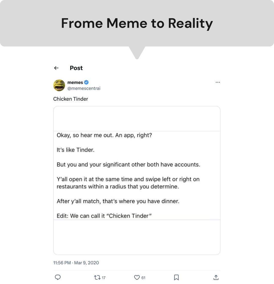
PickEasy was created to help small restaurants compete with larger chains during COVID-19. Inspired by a "Chicken Tinder" meme, co-founders developed a Tinder-style app to connect users with local restaurants. The lockdown in Toronto highlighted the growing disparity and need for digital solutions.
PickEasy's origin story.

Launched before lockdown, PickEasy provides tools for digital menu creation and commission-free coupon distribution, supporting over 40 restaurants in enhancing their digital presence and attracting customers directly.
Old PickEasy Screens
While highly praised by users in app reviews, it soon became clear that the initial design had room for improvement. As the sole contract Product Designer, I was tasked with enhancing PickEasy's mobile experience to provide a smoother and more intuitive interface for its 5000+ users. Through user feedback and collaboration with the co-Founders and engineering team, I implemented a redesign that significantly improved user engagement and satisfaction.

Objectives
Identifying issues causing low user engagement and refining the user experience through in-depth research and proven best practices

Refined the communication of PickEasy's value proposition to ensure better user comprehension

Enhance mobile user experience with user-focused features for better engagement and conversions.

Working closely with my team, we discovered why users were not engaging with PickEasy as much as we'd hoped. We then created a redesign strategy focused on improving the user experience, making navigation more intuitive, clearly highlighting PickEasy's unique benefits, and providing easy access to support. These changes aimed to boost customer satisfaction, build trust, and encourage more users to choose restaurants through our app.
The Challenge
PickEasy faced low user engagement and difficulties in user decision-making, indicating friction points in the user journey.
01 Lack of Personalized Recommendations
Users felt overwhelmed by the numerous restaurant choices and lacked personalized suggestions, making it difficult to find suitable dining options quickly.
02 Inadequate Restaurant Information
Users struggled with incomplete or inconsistent restaurant profiles, which did not provide enough details to make informed decisions.
03 Limited User Reviews and Ratings
The scarcity of user-generated reviews and ratings led to uncertainty and hesitation among users, affecting their trust in the app's recommendations.
Research
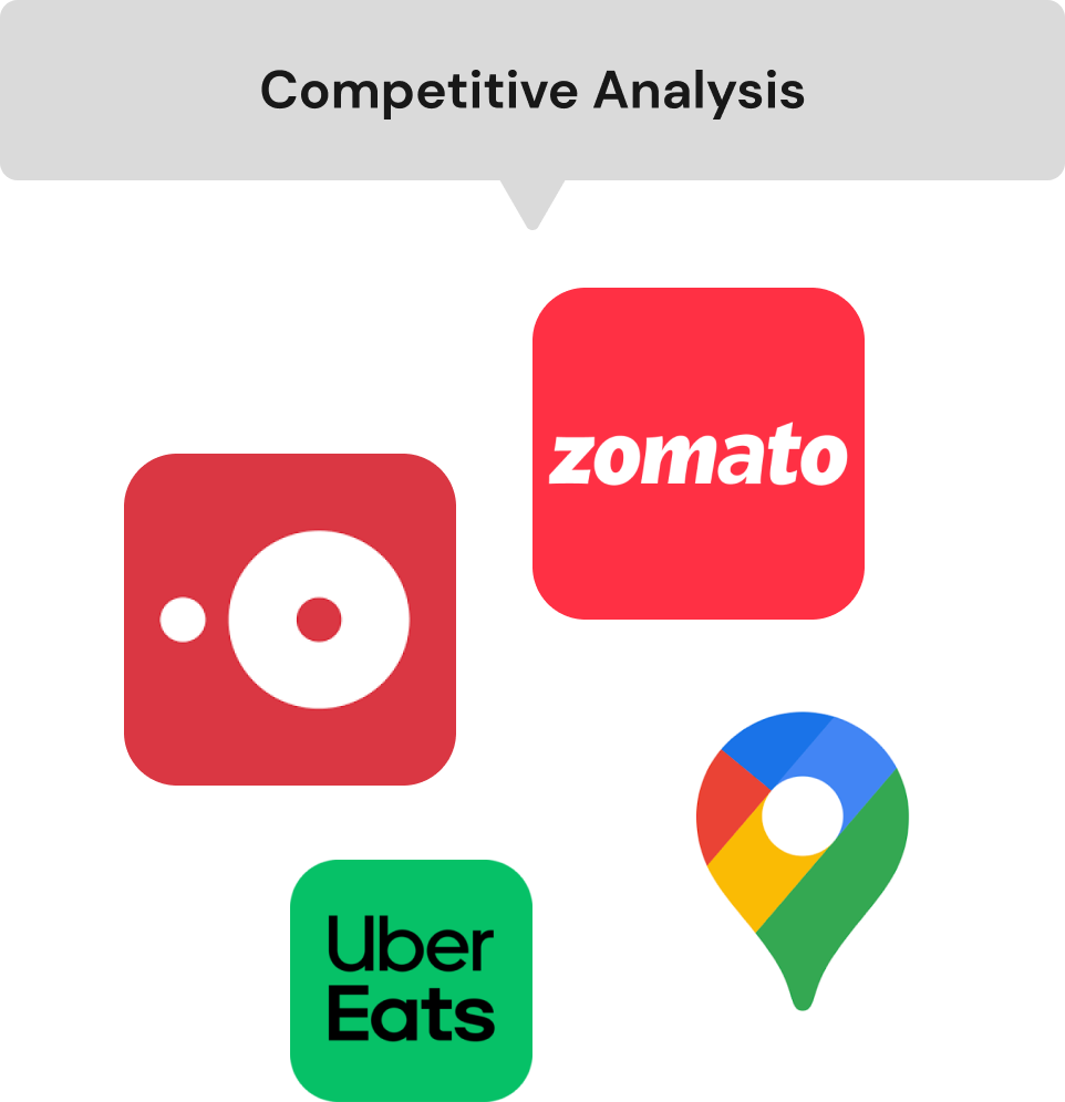
To uncover the root causes of low user engagement, my team and I embarked on a deep dive into user behavior. We conducted insightful surveys, engaging user interviews, thorough usability testing, and a detailed analysis of competitor strategies.
Talked to 30 users in Toronto, mainly frequent diners, to understand their unique concerns and needs.

Conducted competitor app analysis, identified improvement areas, gathered insights to enhance user experience.

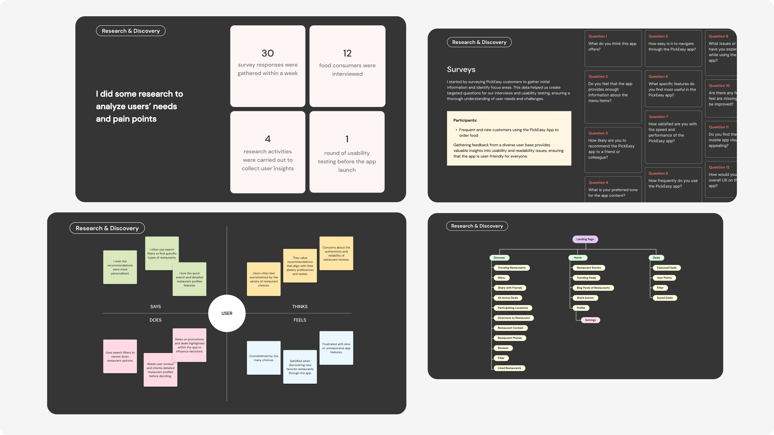
After analyzing user feedback, we discovered that many users struggled with the app's navigation when searching for restaurants. The existing options either lacked intuitive filters or required too many steps to find relevant dining options, leading to frustration and a less efficient user experience.
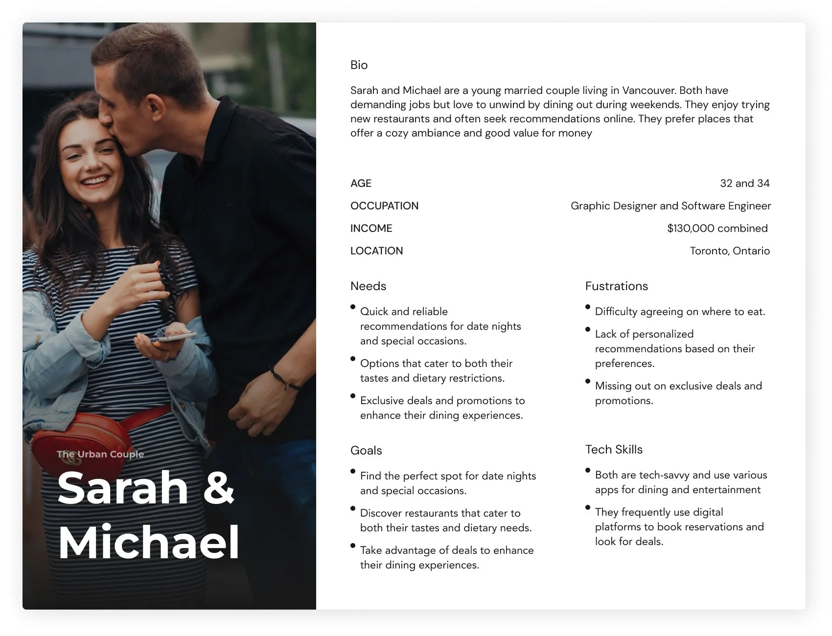
Understanding the User
Through the exploration of these two personas, I identified key overlapping pain points that PickEasy addresses. For both the Foodie Explorer and the Urban Couple, the current dining apps lack personalized and quick recommendations, exclusive deals, and seamless decision-making experiences. These personas highlight the need for a user-friendly interface, personalized suggestions, and easy access to high-quality reviews and photos. These insights were crucial in shaping my design decisions, ensuring that I always referred back to their specific needs to create a more engaging and satisfying user experience.

Paper Prototype
I initiated the design iteration process by conducting preliminary usability testing on the wireframes. Users provided insightful feedback on the accessibility, readability, and overall user experience of the low-fidelity prototype.

Initial wireframes and prototypes
After sketching the initial wireframes, I concentrated on refining key features and improving the screens that needed the most attention. To ensure the design was user-friendly, I tested it with five participants, focusing on their interactions, how they perceived the visuals, and how easily they navigated the interface. The insights revealed that users greatly appreciated the social aspects, particularly on the reviews page, and frequently turned to the blog for guidance on choosing restaurants.
I also plan to enhance the visual impact of the PickEasy Discover screen, as users were very engaged with it but found it challenging to revisit restaurants they initially overlooked but later reconsidered
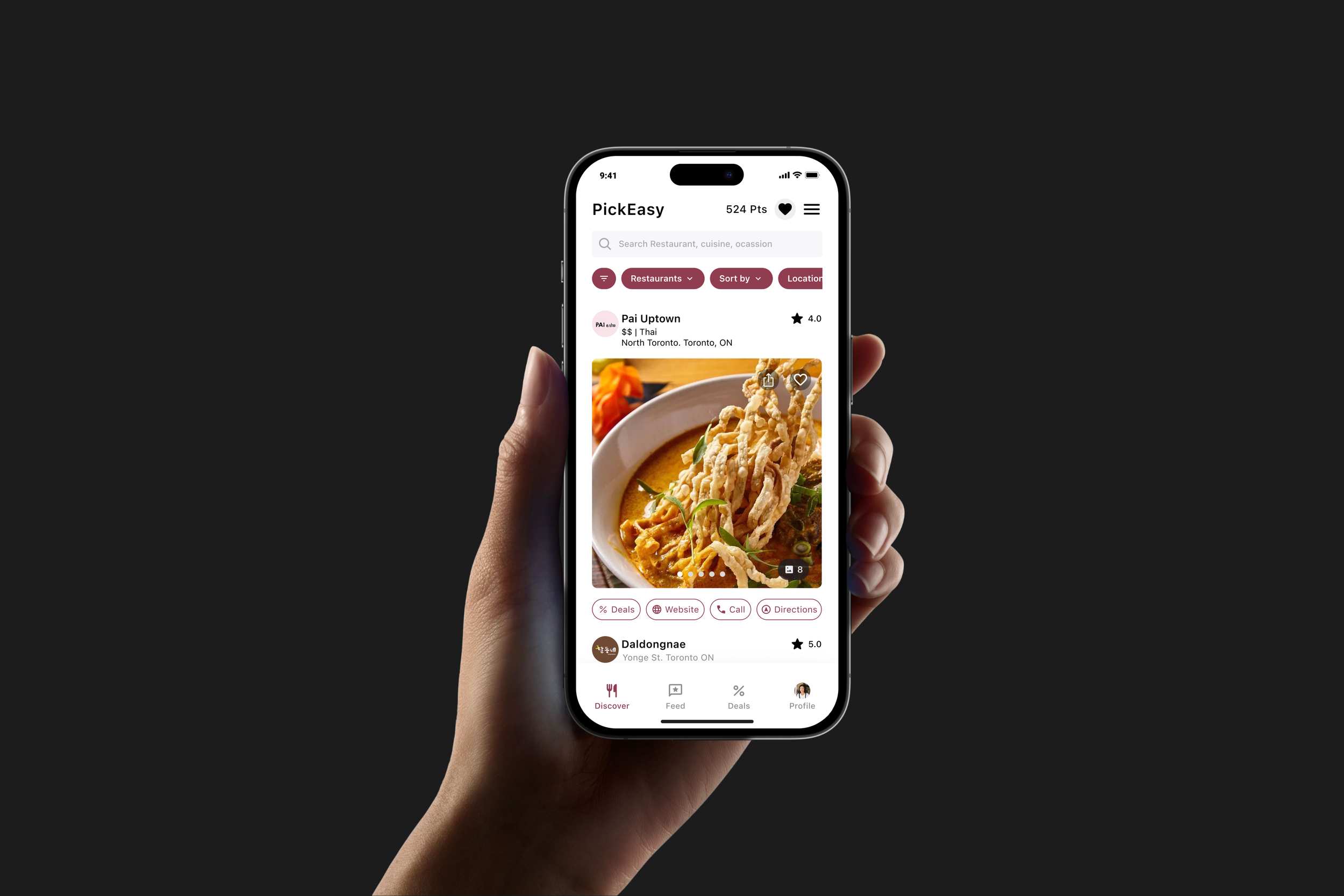
HI-FI Prototype Solutions
DISCOVERY SCREEN
Less Swiping, More Compact
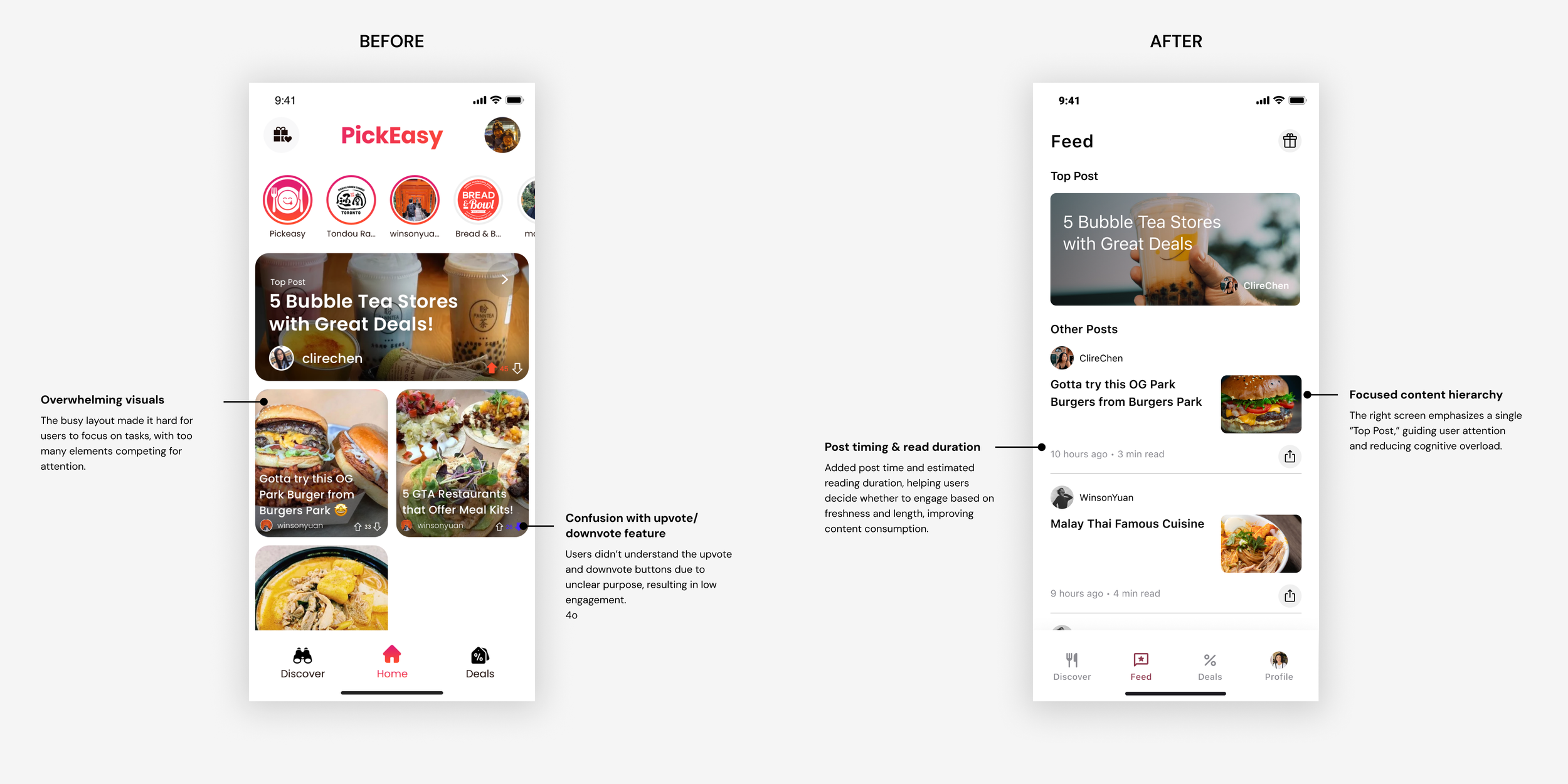
FEED SCREEN
More Clarity
DEALS (MAP) SCREEN
Problem
The swipe-to-choose feature frustrated users and led to rushed decisions. The cluttered layout and hidden filters made finding the right restaurant difficult.
Pain Points Solved
I replaced the swipe with smooth vertical scrolling for easy comparisons. Filters were moved up for quick access, and the layout was cleaned up to make finding key details like websites and directions fast and simple.

Problem
The old feed had cluttered visuals and confusing upvote/downvote buttons, leading to low user focus and engagement.
Pain Points Solved
The improved design introduces a clear content hierarchy with a "Top Post" focus, reducing clutter. Post timing and read duration features help users decide what to engage with, improving the overall experience.
DEALS (LIST) SCREEN
Simple Deals. Clear, Fast, Effortless.
Problem
The swipe-to-choose feature frustrated users and led to rushed decisions. The cluttered layout and hidden filters made finding the right restaurant difficult.
Pain Points Solved
I replaced the swipe with smooth vertical scrolling for easy comparisons. Filters were moved up for quick access, and the layout was cleaned up to make finding key details like websites and directions fast and simple.

Less Effort, More Deals
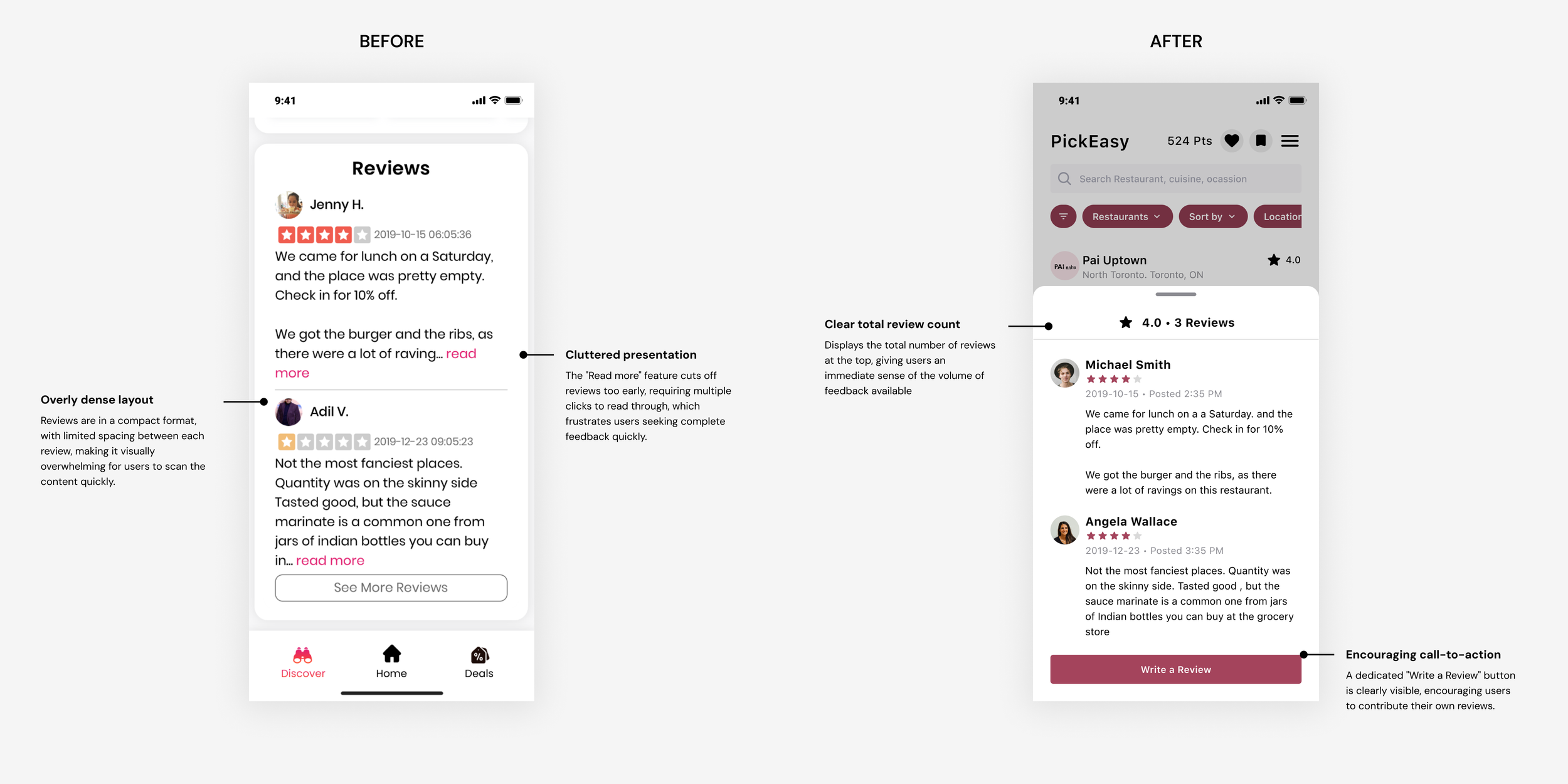
REVIEW SCREEN
Clearer Reviews, Better Insights
Problem
The old map only showed restaurant names, requiring extra clicks to access deal details. This slowed down decision-making, especially for users who prioritized ratings and deal visibility.
Pain Points Solved
The redesigned map lets users preview deals with ratings and expiration dates, reducing taps and speeding up decision-making. Easy switching between map and list views ensures a smoother, more intuitive experience.

Problem
The previous review layout was overly dense, with limited spacing between reviews, making it visually overwhelming for users to scan through feedback. Additionally, the "Read More" feature cut off reviews prematurely, forcing users to click multiple times to get the full review, leading to frustration and incomplete information.
Pain Points Solved
The redesign creates a clean, easy-to-scan layout with added space between reviews. A clear review count gives users instant insights, while the prominent "Write a Review" button invites more contributions, boosting engagement and enhancing the user experience.
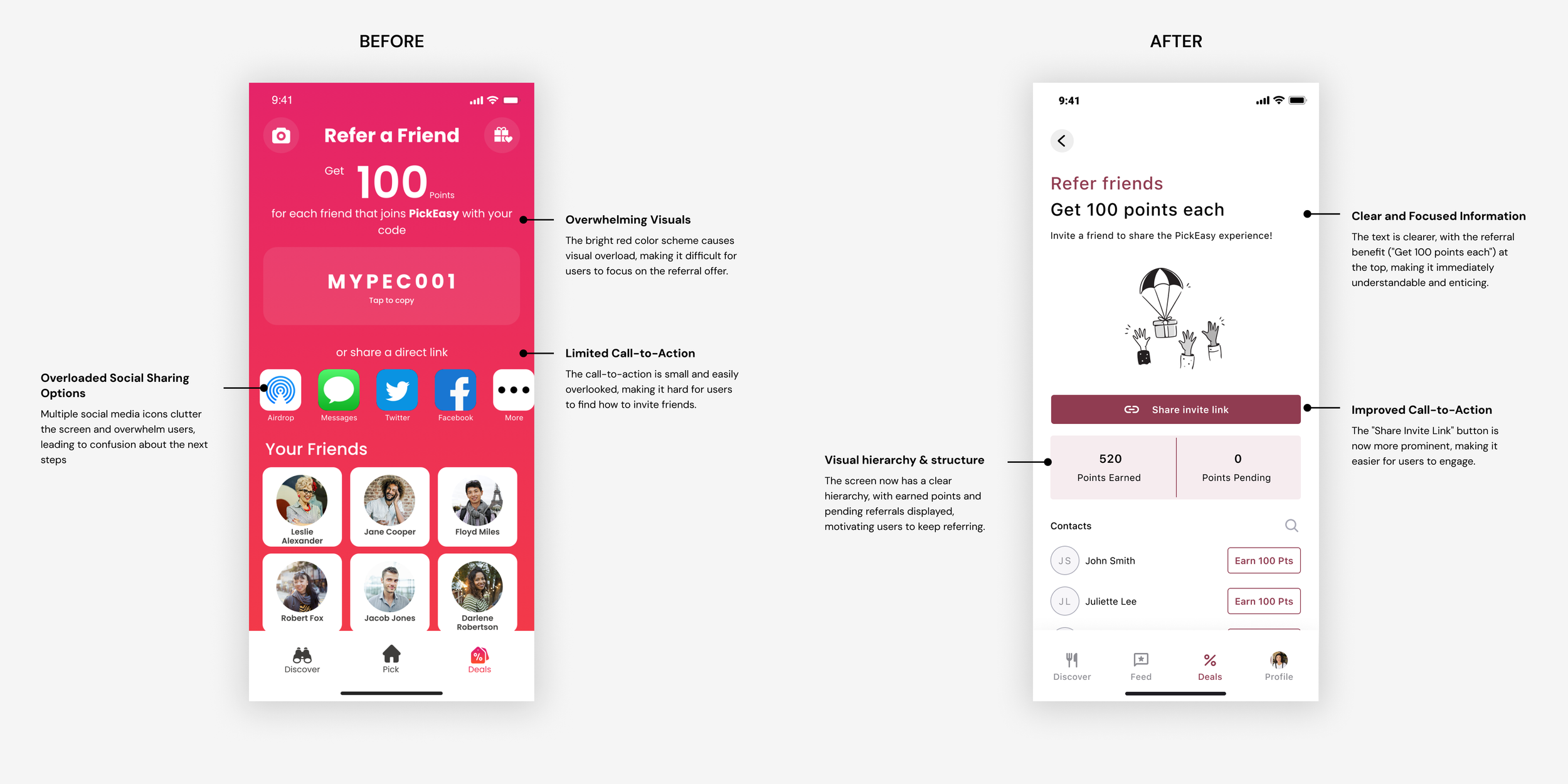
REFERRAL SCREEN
Simplified Referrals, Easier Sharing
Problem
The old screen was visually overwhelming with a bright color scheme and cluttered social sharing options, making it hard for users to focus. The call-to-action (CTA) for sharing was small and easily overlooked, causing confusion about how to invite friends.
Pain Points Solved
The new layout is streamlined, putting the referral benefit ("Get 100 points each") front and center for instant clarity. A more prominent "Share Invite Link" button makes it easier to engage, while displaying earned and pending points motivates users to share even more.
Do more of…
Continuous User Engagement
One key takeaway from the PickEasy project is the importance of ongoing user engagement. Regularly connecting with users throughout the design process provided invaluable insights that guided my decisions. Moving forward, I plan to integrate even more frequent touchpoints with users to ensure that their feedback shapes each stage of development.
Cross-Team Collaboration
Collaboration beyond the core team proved essential in refining the PickEasy experience. By engaging with marketing, engineering, and customer support teams, I gained a more holistic understanding of user needs and technical constraints. I aim to deepen these collaborative efforts in future projects to ensure that every perspective is considered, leading to a more well-rounded and successful product.